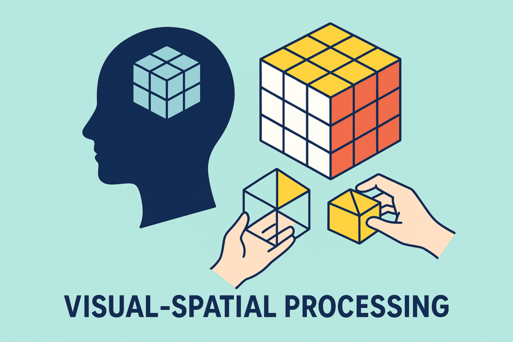
The processing of visual-spatial information enables us to make sense of what we see and to interact efficiently and appropriately with the world around us. It is crucial to our performance of everyday tasks in academic and workplace environments and can support our processing of magnitude. Visual‑spatial processing helps us understand:
- Relative relationships between objects
- Size
- Distance
- Position
This got me thinking about visual affordances: these are interfaces (ways of interacting with objects) which are intended to be instantly understandable. Users can see what actions are possible, or the status of some item, without needing instructions or further explanation. An example of an affordance indicating action is on a door – a plate means you should push it, a handle means you expect to pull it. Doors which have handles but need to be pushed are confusing to the user. Similarly we have visual representations of the status of systems, such as:
- A progress bar on a video recording (when watching recorded CPD, iPlayer, YouTube etc) indicates how far through you are, without presenting the exact timings.
- A satnav system which uses a bar graph to show how far to the next junction/ next services etc, in a way which indicates whether you need to take action soon.
- iCloud storage bar – shows how full, and which types of items are dominating.
- Battery life – the “fullness” of the battery is an intuitive visual representation (although my daughter prefers to see the percentage in digits!)
- Petrol gauge clearly indicate how far from empty you are.
- Rating systems (e.g., 5 stars) show approval in clear steps.
These are great visual cues of magnitude allowing faster understanding, reduced cognitive load and improved accessibility, efficiency and speed. People know what to do just by looking… don’t they?
But it soon becomes clear that some people do not know “just by looking”: visual affordances do not work equally well for everyone. When an interface relies too heavily on visual cues, it can actually exclude or confuse some users.
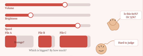
Progress Bars and Quantity Indicators communicate how much through visual size and proportion, but for users with dyscalculia, the visual-to-numerical mapping is fragile. A bar that’s “about 70% full” may be meaningless or misleading — they may not be able to reliably estimate that proportion visually, leading to misjudgements about time, data usage, cost, or completion.
Sliders and Drag Interfaces require users to map a physical gesture in space to a numerical or abstract value. This double demand — spatial movement plus quantity judgment — can be particularly taxing for those with dyscalculia, who may overshoot, undershoot, or lose confidence in their selections.
Many affordances rely on spatial interpretation:
- size
- shape
- position
- orientation
- direction
- “fullness”
People with visual‑spatial difficulties may struggle to interpret these cues.
So, when assessing, I use these real-life examples and affordances, to help look at a person’s understanding of magnitude, as well as spatial processing. I find this especially useful when working with older students and adults.
What do you use informally to assess this area? Let me know!
Please do get in touch:
- rebecca@educationaccess.co.uk
- 07999 016437
Testimonials: